How important is your color choice in headshots? Research shows colors can make or break your chance at getting the client, job or online dating prospect.
It takes people 1/10 of a second to form an opinion of you based on your online image. That impression is powerful and lasting. So, what is the best color for a headshot?
popular brand color by industry
| Color | Associations | Best For | Caution |
|---|---|---|---|
| Blue | Trust, reliability, stability | Finance, law, healthcare, consulting | Avoid light blue backdrops that feel dated |
| Gray / Neutrals | Calm, simplicity, timeless | Corporate, acting, general use | Can feel flat if not lit well |
| Red | Power, passion, urgency | Sales, PR, fashion | Can trigger strong reactions |
| Green | Growth, health, harmony | Healthcare, wellness, food industry | Avoid neon shades |
| Black | Authority, creativity, elegance | Authors, artists, public speaking | May feel too intense for general use |
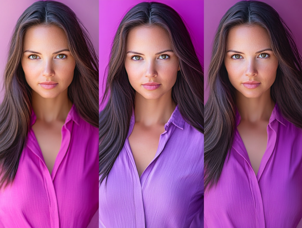
| Pink | Warmth, approachability, femininity | Lifestyle, beauty, social media | Limited use in conservative industries |
| Orange | Innovation, youth, energy | Tech, startups, creative industries | Avoid if you want serious tone |
WHAT IS THE MOST POPULAR COLOR FOR BUSINESS BRANDS ?
Most companies pick blue as the best color for a brand. Therefore, if you are looking for the best headshot color, it would be blue.
Blue, a safe pick for many corporations, is often associated with trust, reliability, and professionalism.
Blue is used in over 75 percent of credit card logos, and 20 percent of fast food logos. However, red is found in the majority of retail brands (over 60 percent), but none of the individual apparel brands, according to a recent study.
Understanding the psychology behind colors and their impact on viewer perceptions allows individuals to make informed decisions when selecting wardrobe for headshots and everyday wear.
By strategically choosing colors that align with the desired impression for business headshots or online dating profiles, you can enhance your chances of making a positive impression.
Most Popular Brand Colors by Industry
Each color tells a story — see how they dominate branding across different industries.
Want a safe brand color? try blue.

you can't go wrong with neutral
In color psychology, neutrals like gray, beige, taupe, white, and soft black carry subtle, professional messages that help the person stand out rather than the clothing.
Additionally, gray backgrounds complement a wide range of skin tones and wardrobe choices, reducing concerns about color clashes. They also maintain a timeless quality, ensuring headshots remain relevant despite changing trends.
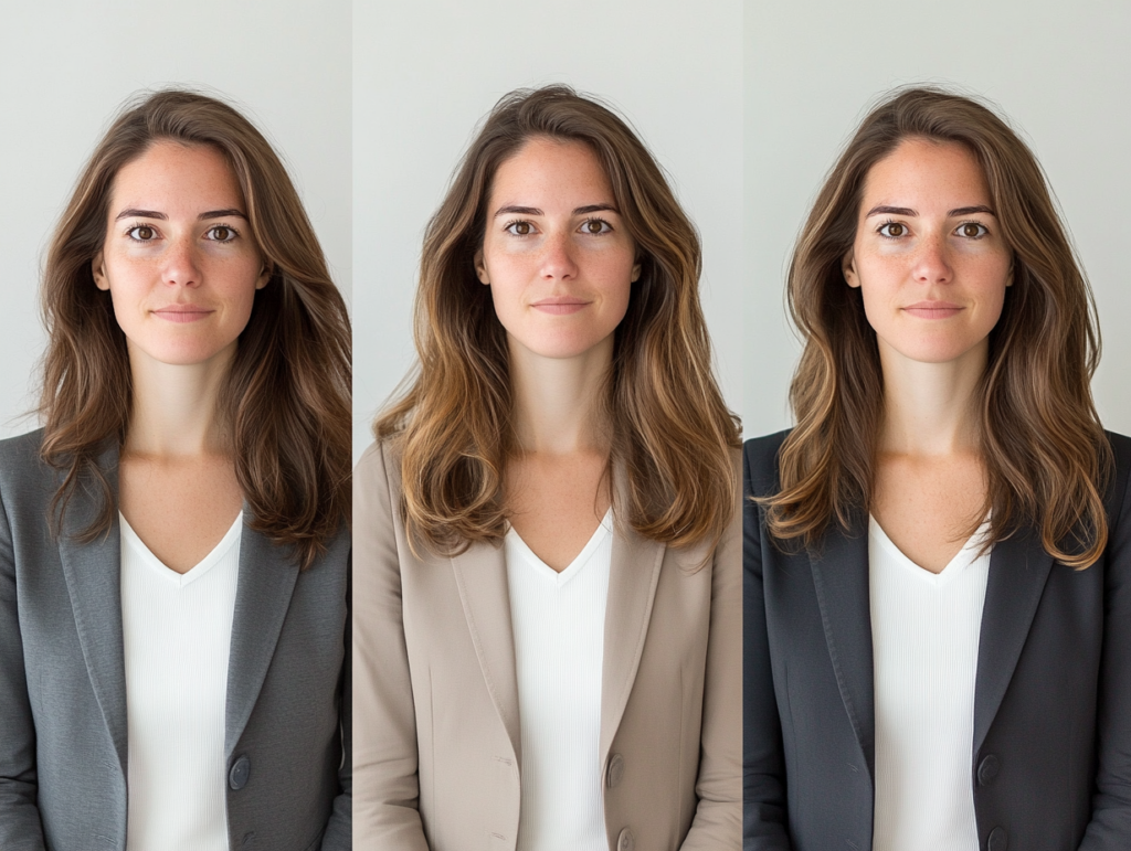
What colors should I use in my headshot?
This is an important decision, which is based on you and your brand. It’s helpful to start with three questions.
1. What message do I want my headshot to send?
Your clothing color helps set the tone — are you aiming for warm and approachable, bold and confident, or calm and professional? Think about how you want someone to feel when they see your image.
2. Will this color flatter my skin tone and photograph well?
Some colors can wash you out or clash with studio lighting. Neutrals, jewel tones, and softer shades tend to be the most flattering on camera — especially in natural light or studio settings.
3. Does this color reflect my personal brand or the industry I’m in?
If you’re in a creative or lifestyle field, warmer or trendier colors might work well. If you’re in finance, law, or healthcare, classic tones like navy, gray, or white convey trust and professionalism.
Studio Newport is an award-winning photography studio located in Newport, Rhode Island.
MORE ABOUT HEADSHOTS
The Science Behind Headshots
Headshot photography is more than just a picture—it’s psychology and art combined. A skilled headshot photographer uses lighting, angles, and expressions to convey confidence and approachability. These elements influence how others perceive you, making a professional headshot a crucial tool for personal branding and career success.
20 Social Media Platforms to Post Your Headshot
Where you spend your professional time online depends on your industry. Here are 20 social media platforms and professional sites where a well-chosen headshot can help you connect with clients and other businesses.
From Casual to Corporate: What to Wear for a Headshot Session
The right outfit for headshots is essential. Opt for solid colors and simple styles that enhance, not distract. A professional photographer will use their expertise in headshot photography to ensure your look aligns with your goals, helping your personality shine through in your photos.
